Sexy Buttons in Pure CSS*

*in this example I use an image to further demonstrate the capabilities of CSS. The buttons look just as good without the image!
I talked briefly about CSS3 in my last post. I want to take some time and demonstrate some of the possibilities created by CSS3. Here I will show you how to make some nice looking buttons using just CSS! While reading through this post, you might feel overwhelmed by the amount of CSS, don't worry; because of browser compatibility, it is required that we specify CSS rules for multiple browsers. Once you get past the multiple-browser support, it's quite simple. Let's jump right into it!
Buttons typically have a few states. The button we're putting together here will have three states: normal, hover, and active- the purpose of each seems straight-forward so I'll save the explanation for another day. The code below shows our setup for the normal state.
.roundButton {
margin:10px;
border-radius:10px;
-webkit-box-shadow:0px 1px #000;
box-shadow:0 1px #333;
height:50px;
width:150px; //optional
border:none;
font:26px Helvetica, sans-serif;
text-shadow:rgba(255, 255, 255, .4) 0 1px 0;
/* ie ]= */
background:url('img/noiseOverlay.png'),
		#4AA1CA;
outline:none;
/* webkit */
background:url('img/noiseOverlay.png'),
		-webkit-gradient(linear, 0 0, 0 50, from(rgba(255, 255, 255, .1)), to(rgba(0, 0, 0, .3))),
		#4AA1CA;
/* gecko */
background:url('img/noiseOverlay.png'),
		-moz-linear-gradient(top, rgba(255, 255, 255, .1), rgba(0, 0, 0, .3)),
		#4AA1CA;
}
Woah! So much code! Don't worry, I'm going to walk you through it now. The margin:10px just creates some space around the button so it stands apart from other elements on the page. The border-raduis:10px rule gives the button nice rounded edges; this is the first CSS3 rule we're using! The second CSS3 rule comes right after; box-shadow:0px 1px #333 creates a shadow behind the element shifted 0 pixels in the x space, and 1 pixel in the y space (down). The -webkit- prefix tells WebKit browsers to render this rule. The border:none rule removes the standard border around button elements. The font declaration is straight-forward. text-shadow:rgba(255, 255, 255, .4) 0 1px 0 is actually our first encounter with a CSS3 rule that isn't supported on the latest version of IE9, not to worry though- this is just a minor enhancement.
This is where things get a bit messy. The background element gets broken into three sections for each of the major browser's compatibility sake. Since IE9 doesn't support CSS gradients yet, we forego the gradient and slap on a solid background. For both WebKit and Gecko based browers, we're in luck! The syntax of the gradients are similar. What we're doing is creating a linear gradient starting from the top and moving to the bottom. We define the colours as white and black with low opacity for both. This, on its own, looks pretty nasty. Since we're working with opacity, the next line of the background rule specifies a colour- a blue in this case.
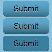
The top button in the image is what we've just created. Pretty spiffy. We still have some work to do though. We're going to tackle both the hover and active states in one go since they're identical apart from the values in each rule.
.roundButton:hover {
/* ie ]= */
background:url('img/noiseOverlay.png'),
		#3A91BA;
/* webkit */
background:url('img/noiseOverlay.png'),
		-webkit-gradient(linear, 0 0, 0 50, from(rgba(255, 255, 255, .1)), to(rgba(0, 0, 0, .4))),
		#4AA1CA;
/* gecko */
background:url('img/noiseOverlay.png'),
		-moz-linear-gradient(top, rgba(255, 255, 255, .1), rgba(0, 0, 0, .4)),
		#4AA1CA;
}

.roundButton:active {
/* ie ]= */
background:url('img/noiseOverlay.png'),
		#2A81AA;

/* webkit */
background:url('img/noiseOverlay.png'),
		-webkit-gradient(linear, 0 0, 0 50, from(rgba(0, 0, 0, .2)), to(rgba(0, 0, 0, .2))),
		#4AA1CA;
/* gecko */
background:url('img/noiseOverlay.png'),
		-moz-linear-gradient(top, rgba(0, 0, 0, .2), rgba(0, 0, 0, .2)),
		#4AA1CA;
}
In the hover state, we only change the gradient to value's opacity to 0.4. This is a very subtle change because we don't want to overwhelm the user when they just hover over a button! For IE, we just change the background to a slightly darker blue.
Last but not least- the active state! Same story as the hover state here. This time though, we're really darkening the gradient (which isn't really a gradient anymore). The from and to values are the same. I'm using this method to create another layer, one to just darken the overall appearance of the button. By doing this, we can use the same colour value as the last layer in the background property to remain consistent.
And there you have it. A sexy button that uses no images*. Previous versions of CSS required us to define background images for such gradients and rounded corners; I'm so glad we can say bye-bye to those days. If you would like the noiseOverlay image I used to give the button some texture, you can grab it here.